Typography

Typography Overview

Typography should feel like the Gold Coast itself: open, optimistic, energetic and easy to connect with. It should welcome people in, move information forward and feel confident without feeling exclusive or busy.

Optimistic
Energetic
Friendly

Principles

  1. Welcoming first

    Type should never feel closed off, technical for the sake of it, or hard to enter. It should be clear, readable and human.

  2. Positive and forward-moving

    Our typography carries momentum. It should feel active, optimistic and confident, not static or overly formal.

  3. Ambitious sans ego

    We use scale and contrast boldly, but never in a way that feels arrogant, luxurious-for-luxury’s-sake, or corporate and cold.

  4. Clear over clever

    Hierarchy, spacing and readability matter more than decorative moves. If the message is strong, the typography does the job.

  5. Built for change

    Our system needs to flex across reports, campaigns, partner materials, presentations, environmental graphics and digital content while still feeling recognisably Gold Coast.

Primary Typeface

GoldCoaster is a custom san-serif typeface designed to represent the playfulness and unpretentiousness of the Gold Coast while paying homage to the rich typographic history of our motels, holiday apartment blocks and the small businesses this city was built on. Its boldness and playfulness allows it to perform in all contexts, adapting to the seriousness of the conversation, while being expressive enough to hold its own.

The type family is made up of three core styles: GoldCoaster Display, GoldCoaster Text Bold and GoldCoaster Text Regular. Together, they create a flexible system that can move between expression and utility while staying recognisably Gold Coast.
GoldCoaster Display

GoldCoaster Display is the most expressive voice in the type family. It is used for headlines, hero messages, large numbers and high-impact brand moments. Bold, optimistic and full of personality, it brings energy and confidence to the brand without feeling polished or exclusive.

Aa

GoldCoaster Text Bold

GoldCoaster Text Bold is used to create emphasis, structure and hierarchy. It works well for subheadings, callouts, labels and short supporting statements. Carrying with it some of the unique quirks of the display font, Bold helps information feel clear and organised.

Aa

GoldCoaster Text Regular

GoldCoaster Text Regular is the workhorse of the family. It is used for body copy, captions and longer-form reading. Clear, grounded and easy to read, it brings consistency to the system and ensures the brand remains accessible across more detailed content.

Aa

Typeface features

The typeface includes custom details that give it a distinctive Gold Coast character. It features a tall x-height, unique pinching connection points, angled stems and a unique blend of sharp and rounded shapes to help it feel confident, optimistic and easy to connect with across both expressive and practical applications.

  • 1/2

    Fractions

    The dynamic fractions feature automatically substitutes typed fractions for pre-built ones.

  • 5:00am

    Contextual Alternates

    Contextual alternates intelligently substitutes characters or applies ligatures to them depending on context. For example, when a colon is placed between numbers for time of day, it bumps into a mid-height placement.

  • (Fun)

    Hairline Punctuation

    Provides finer punctuation marks for more considered typography, especially in larger settings or more refined layouts.

  • GoldCoaster

    GoldCoaster wordmark

    The wordmark is baked into the typeface. Open the glyphs panel to find the workmark.

  • é

    Accent support

    The family supports common accents and additional characters for common language support.

  • ← →

    Arrows

    A custom range of arrows in all weights for consistency.

Secondary Typeface

P22 Mackinac is our secondary typeface. It is used sparingly as a serif alternative when a piece needs a different tone, a more editorial feel, or a touch of contrast against the primary type system.

It should never compete with the GoldCoaster family or replace it as the main brand voice. Instead, it is used selectively to add texture, warmth or a more literary feel in the right contexts.

Whatever it is,
it can be better.

Secondary font usage

  1. Pull quotes

    Use to break up long-form content and give featured statements a distinct, human voice.

  2. Editorial moments

    Use in storytelling or features to add a layer of warmth and a more literary feel.

  3. Stand-firsts

    Use to frame the beginning of a section and add immediate contrast to the main content.

  4. Occasional emphasis

    Use selectively when a sudden shift in serif voice is needed to highlight a specific thought.

Modular Scaling

Our type scale is a system of “proportions” rather than just a list of random sizes.

The base measurement is called an em. Our type scale is built on a simple rule: 1em = 16pt.

All other sizes are scaled up or down from that. For example, 2em is twice as large, and 0.5em is half the size.

By using this scale, we ensure that whether you are designing a social media tile or a massive billboard, the relationship between our headlines, subheadings, and body text always stays perfectly in proportion. It creates a visual rhythm that feels intentional, professional, and on-brand.

  • font-family:GoldCoaster

    font-weight:Display

    font-size:7em–12em

    line-height:100%

    letter-spacing:0%

    Oversized

  • font-family:GoldCoaster

    font-weight:Display

    font-size:5em–7em

    line-height:100%

    letter-spacing:0%

    is-h1

  • font-family:GoldCoaster

    font-weight:Display

    font-size:3em

    line-height:100%

    letter-spacing:0%

    is-h2

  • font-family:GoldCoaster

    font-weight:Display

    font-size:2.5em

    line-height:100%

    letter-spacing:0%

    is-h3

  • font-family:GoldCoaster

    font-weight:Bold

    font-size:2em

    line-height:100% – 120%

    letter-spacing:-5% – 0%

    is-h4

  • font-family:GoldCoaster

    font-weight:Bold

    font-size:1.5em

    line-height:100% – 120%

    letter-spacing:-5% – 0%

    is-h5

  • font-family:GoldCoaster

    font-weight:Bold

    font-size:1em

    line-height:100% – 120%

    letter-spacing:-5% – 0%

    is-h6

  • font-family:GoldCoaster

    font-weight:Text

    font-size:2em

    line-height:100% – 150%

    letter-spacing:-5% – 0%

    is-txt-xl

  • font-family:GoldCoaster

    font-weight:Text

    font-size:1.5em

    line-height:100% – 150%

    letter-spacing:-5% – 0%

    is-txt-l

  • font-family:GoldCoaster

    font-weight:Text

    font-size:1em

    line-height:100% – 150%

    letter-spacing:-5% – 0%

    is-txt-m

  • font-family:GoldCoaster

    font-weight:Text

    font-size:0.9em

    line-height:100% – 150%

    letter-spacing:-5% – 0%

    is-txt-s

  • font-family:GoldCoaster

    font-weight:Text

    font-size:0.7em

    line-height:100% – 150%

    letter-spacing:-5% – 0%

    is-txt-xs

  • font-family:P22 Mackinac Pro

    font-weight:Body

    font-size:2em

    line-height:100% – 120%

    letter-spacing:-5% – 0%

    is-alt-xl

  • font-family:P22 Mackinac Pro

    font-weight:Body

    font-size:1.5em

    line-height:100% – 120%

    letter-spacing:-5% – 0%

    is-alt-l

  • font-family:P22 Mackinac Pro

    font-weight:Body

    font-size:1em

    line-height:100% – 120%

    letter-spacing:-5% – 0%

    is-alt

  • font-family:P22 Mackinac Pro

    font-weight:Body

    font-size:0.9em

    line-height:100% – 120%

    letter-spacing:-5% – 0%

    is-alt-s

  • font-family:P22 Mackinac Pro

    font-weight:Body

    font-size:0.7em

    line-height:100% – 120%

    letter-spacing:-5% – 0%

    is-alt-xs

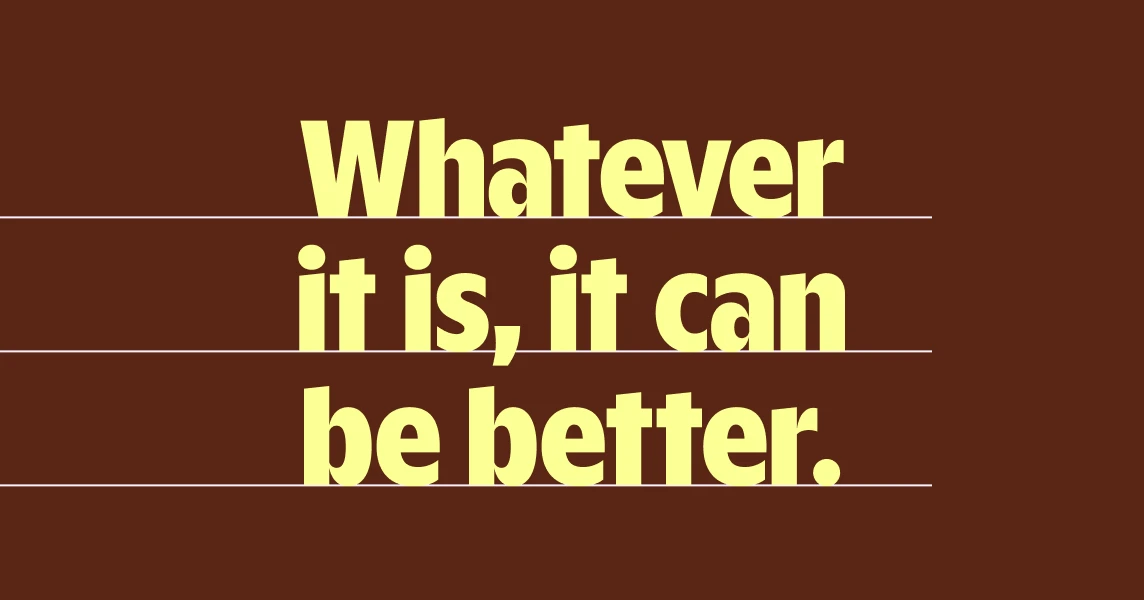
  • Leading example with horizontal guides across display type

    Leading

    Leading, also known as line height, is the space between each line of text. Leading should vary depending on the size of the typography. Aim for a value between 85% and 120% of the type size. Larger headlines use a lower values, while body text uses higher values.

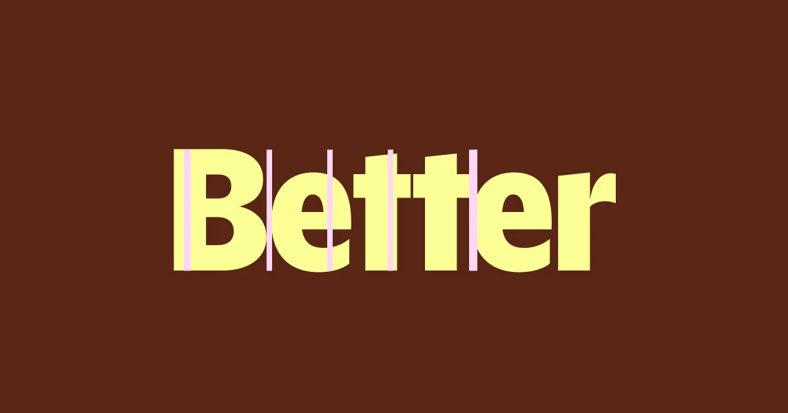
  • Tracking example with vertical guides between letters

    Tracking

    Tracking is the spacing between all glyphs in a string of text. Aim for a value between -3% and 0% (-30 and 0 in Adobe software). Tracking may be adjusted beyond 0% to improve legibility at smaller sizes.

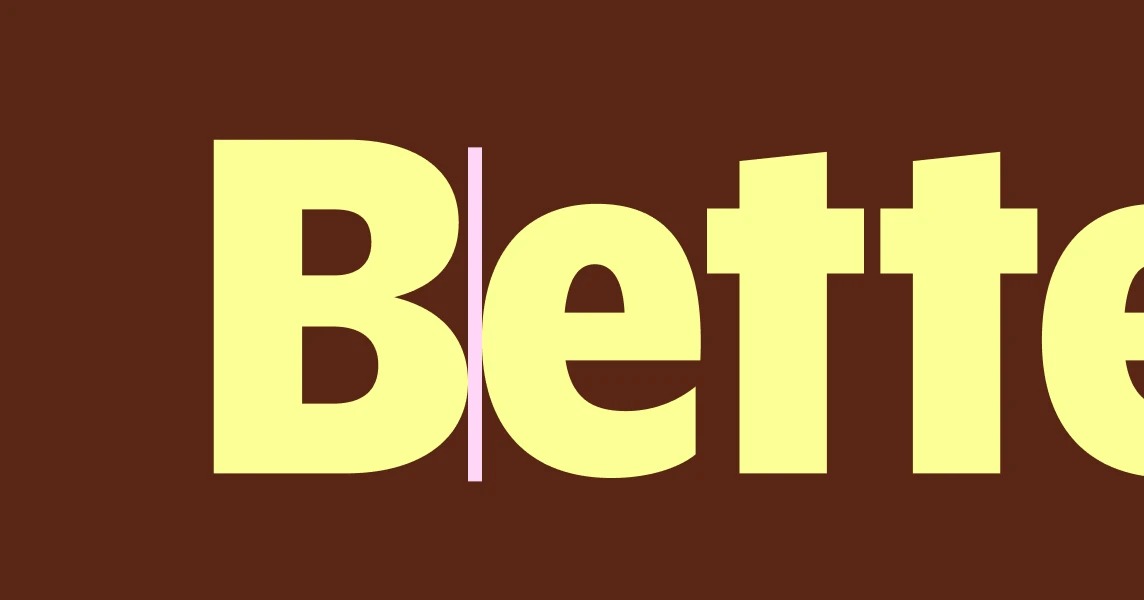
  • Kerning example with a guide between two glyphs

    Kerning

    Kerning is the space between a given two glyphs. Kerning pairs have already been established and tested by the typeface designer, so manual adjustment is usually not necessary. Manual kerning adjustment may be useful in instances where type is set very large, and so the distance between letterforms requires tweaking.

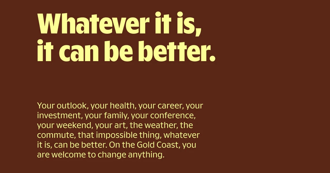
  • Hierarchy example showing contrast between display and body type

    Hierarchy

    Hierarchy is the relationship between type sizes in a composition and the flow of information. Aim for high contrast between text sizes across hierarchy levels. The higher the contrast, the clearer the levels of hierarchy will be.

Scale Guidance

  1. Use only sizes from the approved scale.

  2. If a size isn’t on the scale, it needs a clear reason.

  3. Use fewer sizes per layout, not more.

  4. Contrast should come from clear jumps, not tiny differences.

Grid & Spacing

To maintain a sense of energy and order, our layout is built on a disciplined 0.5em (8pt) grid system.

This overarching rule ensures that every typographic element—from line-height and paragraph spacing to margins and gutters—aligns to a consistent vertical and horizontal rhythm. By anchoring our design to this grid, we create a sense of structural integrity that allows our bold typography to feel intentional and grounded, ensuring that even our most ambitious layouts remain clean, professional, and easy to navigate.

Practical Guide

WORKING RULES

Display: tighter leading for energy and impact. Keep tracking at 0.

Text: Smaller text to open up leading (120%–150%) and tracking (0). Larger text can have tighter leading (100%) and tighter tracking (-2%–-5%).

Whatever it is,
it can be better.

  • Headline is 4x body size

    Get it on the grid

    Line-height, paragraph spacing, margins and layout spacing should resolve to a 4pt grid.

  • Headline is 4x body size

    Consistent sizing and spacing

    Use the typography scale system and approved scales for spacing values.

  • This statement works by itself

    Use space as a guiding principle

    Let spacing create hierarchy before adding extra styling. Group related text tightly and separate different content clearly.

  • Less is more

    Fewer sizes, fewer groups of text is always easier to read. Sometimes everything in a single size (including a heading) is easier to consume.

Hierarchy

Our hierarchy should feel confident, simple and easy to digest. It should make it clear what to look at first, what supports it, and what can be read in detail. We use clear differences in scale, supported by weight and spacing, to guide the reader through the content.

Each layout should have one clear entry point and a logical flow, without competing elements. The result is typography that feels direct, easy to navigate and effortless to understand.

  • It’s better

    One idea leads

    Each page, screen or spread should have one obvious entry point.

  • It’s better

    No more than three active levels at once

    In most layouts, keep it to: one primary heading, one secondary level, one body level

  • Level 1

    Use scale to group information, use weight for flow

    Create hierarchy mainly through scale. Use weight to support, not replace, hierarchy.

  • Section one
    The story

    Keep reading patterns consistent

    If a report uses one heading structure, keep it consistent across the whole document.

Case

  • Sentence case

    The default for most communication.

  • Title Case

    Use sparingly for named initiatives or campaign titles where it suits the composition.

  • ALL CAPS

    Use sparingly if all else fails.

Alignment

  • Left align by default

  • Centered

    Use centred type only for specific moments such as covers, title cards or formal hero compositions.

  • Right or justified

    Avoid unless intentional

Typeface

  • Use GoldCoaster Display when:

    the message needs energy; the title needs to carry the page; a stat or statement is the hero; you want an unmistakable brand moment

  • Use GoldCoaster Text Bold when:

    content needs structure; you’re introducing sections; a label or number needs emphasis; data needs quick scanning

  • Use GoldCoaster Text Regular when:

    people need to read comfortably; content is longer than a sentence or two; you’re explaining, clarifying or supporting

Application by context

The brand has 2 typographic modes: Expressive & systematic. These can coexist but with reasoning and consistency.

Campaigns and brand moments

Lead with GoldCoaster Display. Keep the message short. Let scale do the work.

Typography used in a campaign and brand moment

Context 2

//

Typography in use example two

Context 3

//

Typography in use example three