
Content
Content Overview
Our photography and videography don't observe from a distance—they move closer. They find the texture by capturing this city not as a postcard, but as a living, working, moving place where transformation happens in the everyday. Our approach is intentional, atmospheric, and human. We favour intimacy over scale, narrative over documentation, and feeling over perfection.
Our Approach
We build our visual language from texture, movement, and proximity. Every technique serves the story—not as embellishment, but as meaning.
We move in close.
Close-ups and extreme close-ups on hands, textures, faces, materials, objects in action. This is where craft lives. This is where you see the evidence of work, of care, of transformation. The macro view reveals what wide shots miss: the grain of timber, the concentration in a maker's eyes, the smudge of paint on a thumb.
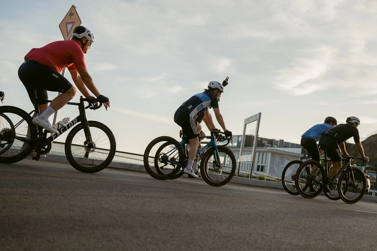
We capture moments as they unfold.
Not posed, not waiting for permission—in the moment. This is where authenticity lives. The laugh between takes, the adjustment of a tool, the glance between collaborators. These are the frames that feel true because they are.
We pursue colour with intention.
Rich, warm, cinematic tones ground the work in a specific emotional register—nostalgic without being sentimental, vibrant without being loud. Colour tells us how to feel before we've consciously registered what we're seeing.
We shift perspective constantly.
Creative lenses—wide angle, fisheye—distort in service of immersion. Handheld movement follows the action, shoulder to shoulder with the subject. We vary angles not for variety's sake, but to find the most truthful view: sometimes that's eye-level intimacy, sometimes it's overhead geometry, sometimes it's ground-up awe.
We embrace duration.
Long exposures blur motion into feeling—traffic becomes light, water becomes silk, a crowd becomes energy. Time stretches and collapses. What was chaotic becomes meditative. What was still becomes alive.
Texture becomes the subject.
Leading lines draw the eye through architecture and landscape. Patterns reveal rhythm in repetition—tiles, waves, scaffolding, footsteps. Negative space creates breathing room, letting compositions feel considered rather than cluttered. We find structure in the built and natural environment, and we use it.
We isolate what matters.
Direct flash pulls a subject from its surroundings. Shallow depth of field holds focus on a single gesture, a single face, a single moment of making. We use light and lens to direct attention, to say this matters, look here.
We work with texture in camera.
Film grain, motion blur, haze, prism effects—these aren't nostalgic affectations. They're tools that add depth and atmosphere, that soften the clinical and invite the viewer in. They create visual space for emotion to land.
Framing & Shot Selection
Closeness is our default—we work in extreme close-ups and close-ups where meaning concentrates, shifting perspective constantly to find the most truthful view.
Extreme close-ups dominate.
Textures under fingertips, expressions mid-thought, materials mid-transformation. This is where we see skill, effort, personality—where the evidence of making lives. Get in close, make it personal.
Vary angles relentlessly.
Overhead. Ground-level. Dutch tilt. Through windows. Over shoulders. The world doesn't happen at eye level only—neither should our framing.
Earn every wide shot.
Environmental shots only when they add narrative value. A coastline means nothing alone; a coastline after we've seen the artist collecting materials from the shore tells us about relationship to place. Context earns its presence.
Colour & Effects
Our palette is slightly warm-toned, cinematic, and rich—think late afternoon light through a window, amber streetlights on wet pavement, the glow of a workshop lamp. Colour that feels emotionally resonant, not historically specific.
Maintain rich, warm saturation.
Colour should carry weight without distraction—never flat or washed-out, never hyper-saturated or artificial. This is the emotional register: nostalgic without being sentimental, vibrant without being loud.
Effects serve emotion and narrative.
Film grain, texture overlays, light leaks, lens flares, prism effects, soft focus, bloom, digital artifacts, overlay composites—each chosen deliberately to add atmosphere, depth, and feeling.
If it doesn't add meaning, remove it.
Every effect must earn its presence. We're building stories, not decorating frames.
Motion & Flow
We blend handheld energy with static contemplation, using movement that feels intentional and matches the mood we're building.
Balance handheld and static.
Handheld brings energy, immediacy, presence—we're in the action. Static shots provide breathing room, contemplation, compositional precision. The interplay creates rhythm.
Speed manipulation with purpose.
Film grain, texture overlays, light leaks, lens flares, prism effects, soft focus, bloom, digital artifacts, overlay composites—each chosen deliberately to add atmosphere, depth, and feeling.
Intentional movement always.
Whether it's the smooth glide of a gimbal or the organic sway of a shoulder-mounted rig, we're not chasing chaos—we're finding motion that matches mood.
Pacing & Rhythm
We alternate between slow, contemplative moments and quick, energetic cuts to create dynamic emotional range that keeps viewers engaged and responsive.
Vary duration deliberately.
Let a hand shaping clay hold for five seconds. Cut rapidly through urban textures—brick, steel, glass—in two. Textures and gestures linger when they serve emotion or craft. The variation creates dynamic range.
Build montages from curated details.
Editorial cuts that prioritise texture, hands, materials, architecture—coffee pouring, fingers adjusting tools, sunlight on walls, fabric being cut. Not random, but curated for cumulative emotional effect.
Transitions feel organic.
Dissolves and crossfades, light leaks that bridge scenes, match-on-action cuts, visual motifs that recur. Never dated wipes, aggressive zooms, or spinning effects. We trust the material to hold attention without rushing.
Sound & Music
Music should skew indie, electronic, ambient, lo-fi—crafted, textured, with personality—while environmental sound grounds viewers in physical, real space.
Choose music with a point of view.
Avoid generic corporate stock. If it sounds like a LinkedIn ad or property developer promo, it's wrong for us. We're building atmosphere for stories about real people doing real work.
Use environmental sound intentionally.
Footsteps on gravel, waves breaking, machinery hum, fabric dragging, doors closing. These sounds ground viewers in physical space, adding realism and intimacy.
Design sound as carefully as visuals.
Sound should be as considered as composition. Silence, when used deliberately, can be as powerful as score.
Representation
Gold Coast is home to people from every background, every discipline, every story. Our photography and videography reflect that—not as a checklist to be ticked, but as the truth of the place.
Highlight capability and individuality.
Focus on skill, craft, collaboration, personality. Show people doing what they actually do: the chef mid-prep, the athlete mid-training, the artist mid-process, the organiser mid-event. Identity is present, but it's not the whole story. People are not symbols—they're makers, thinkers, doers.
Work with communities where appropriate.
Especially when telling stories about specific cultural or community contexts, engage residents as collaborators and co-producers. Ask permission. Understand context. Make space for people to represent themselves.
Integrate diversity naturally into the story.
This means casting, locations, and narratives that reflect the breadth of Gold Coast life without making anyone a token. If someone appears in our content, it should be because their story, their work, or their presence serves the narrative—not because we needed to "include" them.
Avoid performative gestures.
Representation should feel organic, not forced. If diversity looks like an afterthought or a quota, we've failed. The goal is not to point at inclusion, but to embody it so thoroughly it becomes unremarkable.
Incorrect usage
These are the visual clichés and approaches that flatten Gold Coast into something generic, surface-level, or dishonest. We don't do them.
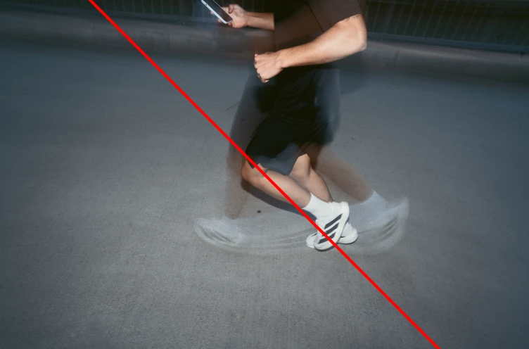
Long and medium shot dominance.
Pulled-back, observational framing that never gets close enough to matter.
Obvious staging.
Posed smiles, directed gestures, people pretending to do things they're not actually doing.
Golden hour only.
Sunrise and sunset are beautiful, but they're not the only light worth capturing. Midday harshness, overcast softness, artificial light—all valid.
Clinical sharpness everywhere.
Perfect focus on everything flattens depth and removes atmosphere.
No atmospheric depth.
Images that feel like they were shot in a vacuum—no haze, no texture, no sense of air between camera and subject.
Sterile, overly clean images.
Gold Coast is a working, living place. Our visuals should reflect that—not sanitise it.
Always eye-level shooting.
The default perspective is boring. Shift it.
Tripod-only rigidity.
Locked-down framing that removes energy and presence.
No sense of motion or energy.
Static images that feel lifeless, disconnected from the activity they're meant to capture.