
Colour
Colour Overview
Our colour system captures the Gold Coast at its most distinct: bright, warm, natural and always changing. It reflects the meeting of coast, city and hinterland, and the shifts in light, energy and mood that happen across the day.
Principles
The system is designed to be flexible. It gives us bold, recognisable brand moments through our preset gradients, while the broader palette allows for range across campaigns, reports, partnerships and digital content. Used well, colour should feel optimistic, open and full of momentum — never random, muddy or overworked.
Colour expresses place
Our colours should feel rooted in the Gold Coast — its light, landscape, warmth and sense of change.
Lead with clarity
Colour should support hierarchy, legibility and meaning. It should never get in the way of the message.
Keep it bold, not busy
The palette is broad, but layouts should still feel controlled. Fewer colours used well will always feel stronger than too many colours competing at once.
Use contrast with intent
Strong contrast gives the brand energy and clarity. Low-contrast combinations should only be used when readability is not affected.
Flex the system, don’t break it
The system is built to allow variety, but every combination should still feel recognisably Gold Coast.
Core palette
The brand uses a broad palette of solid colours and tonal steps. These colours give the system flexibility across print, digital, information-led layouts and partner materials.
Building colour combinations
Our colour system is flexible, but it works best when colour is used with intention. Choose combinations that feel distinctive, balanced and right for the message — not just safe, and not chaotic for the sake of it.
Avoid defaulting to monotone palettes
They can feel safe, but often lack energy and contrast. Use them only when restraint is the point.
Keep it to three colours maximum, preferably two
Most applications should feel two-tone, with a third colour used only for emphasis.
Think of your audience
Some audiences will respond well to bolder combinations, while others need something more restrained.
Let colour set the tone
Colour should support the mood of the message — energetic, calm, playful, formal or optimistic — but never boring.
Approach
Start with a core colour
Choose one lead colour to do the heavy lifting. This gives the layout a clear visual anchor and stops the palette from feeling undecided.
Add a supporting colour
Bring in a second colour to create contrast, hierarchy or energy. It should support the core colour, not compete with it.
Keep it consistent
Once a combination is working, apply it consistently across the layout. Repeating the same colour logic helps the design feel intentional and easy to follow.
Feeling
Clean and deliberate
Colour combinations should feel chosen, not accidental. Each colour should have a clear role in the composition.
Bright and optimistic
Our palette should feel lively, open and full of energy. Even restrained applications should still carry a sense of freshness and positivity.
Balanced and controlled
Aim for enough contrast to create interest, without making the layout feel chaotic. The best combinations feel expressive but still composed.
Avoid
Equal-strength colours
Avoid using multiple colours that all shout at the same volume. The palette should have a clear lead colour and a clear supporting role.
Using every colour
Just because the palette is broad doesn’t mean every layout should show it all. Too many colours at once can dilute the brand and weaken the message.
Visual heaviness
Avoid combinations that feel dense, muddy or overworked. If the colour is making the layout feel harder to read or navigate, simplify it.
Gradients
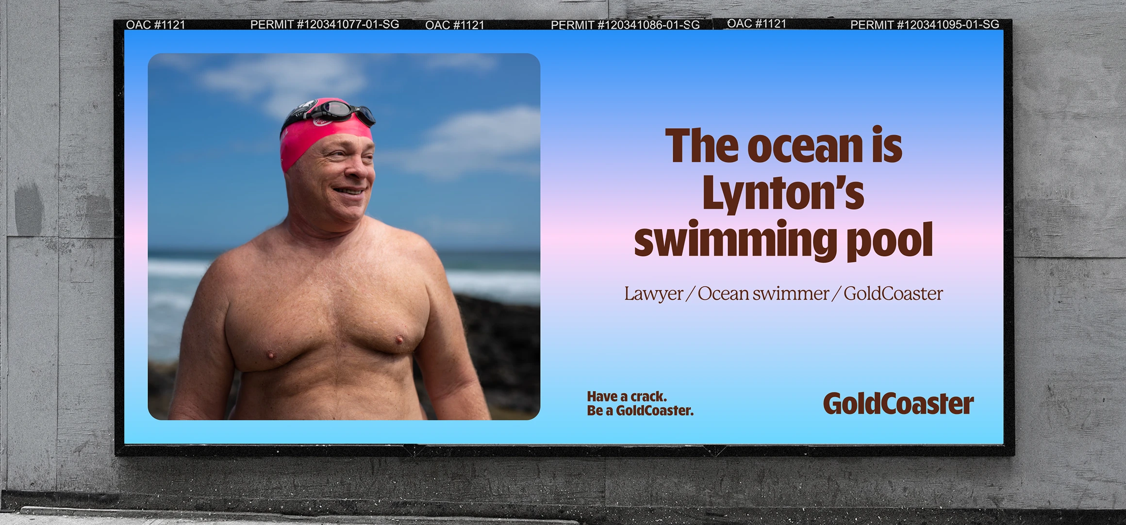
Our preset gradient blocks are a key part of the visual identity. They bring movement, atmosphere and a sense of place into the brand.
Using the gradients
Gradients are fun and loud and are great for certain occasions. But, not everything needs a gradient or be the center of attention. Use sparingly and tastefully in moments that feel right.
Gradient guidance
Use the preset gradients as designed.
In most cases, use one gradient block per layout or surface.
Let the gradient be the hero. Pair it with simple typography and clean composition.
Use solids from the palette to support, not compete with the gradient.
Accessibility and contrast
Colour should always support legibility.
When accessibility compliance is required, contrast must take priority over expression.
Use darker text on light colours and lighter text on dark colours.
Use solid colour backgrounds instead of gradients when readability is critical.

For charts, diagrams and infographics, make sure categories can still be understood without colour alone.
If a layout needs to meet higher accessibility standards, use the most contrast-safe options in the palette rather than the most expressive ones.
Application by context
Campaigns and brand moments
Lead with GoldCoaster Display. Keep the message short. Let scale do the work.

Context 2
//
Context 3
//
Remember:
Gradients create expression.
Solids create structure.
Both should work together to feel bold, clear and unmistakably Gold Coast.