Logo
Logo Overview
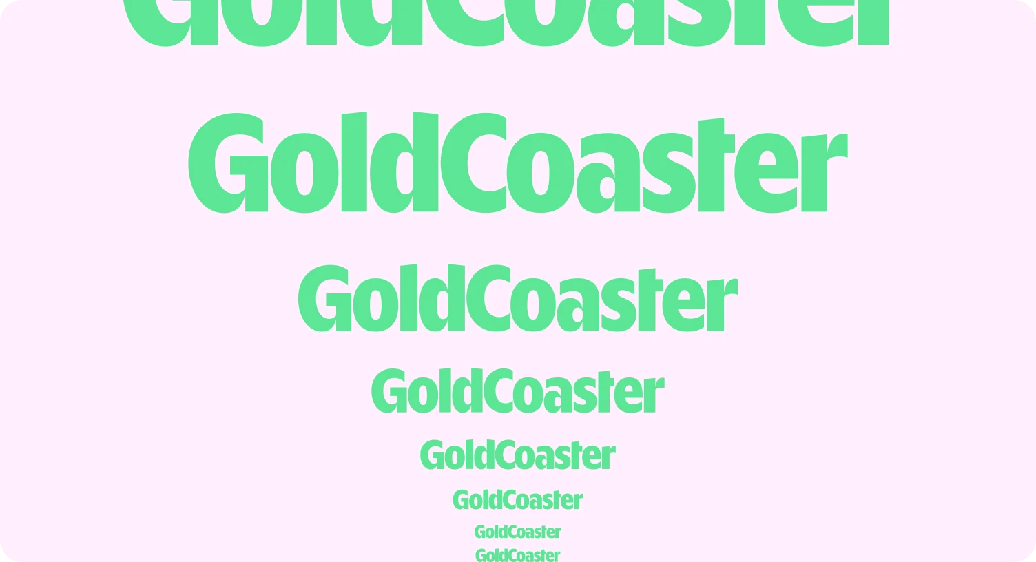
The GoldCoaster wordmark is the clearest expression of our brand. It is bold, distinctive and easy to recognise, so we keep it simple: use it consistently, give it room to breathe, and never alter its form.
The wordmark
Because the wordmark is our sole logo asset, it should always be used with care and consistency. Its strength comes from its shape, spacing and proportion, so it should never be redrawn, altered or embellished.

Clearspace
To keep the wordmark clear, confident and easy to recognise, always leave enough space around it.
Our clearspace is measured using the arrow cut-out inside the G. This shape forms a built-in unit of measurement for the logo system.
Minimum clearspace = 1X on all sides, where X is the width of the arrow cut-out in the G.
No text, graphics, imagery or page edges should enter this space. Giving the wordmark room to breathe helps it remain legible and protects its impact across all applications.

Minimum size
The wordmark should always remain clear and legible. Never reproduce it so small that its character shapes begin to close up or lose definition.
Use the logo at a size where the full wordmark reads clearly at a glance. If space is too limited to reproduce it properly, it should not be used.
If you want, you can add a hard minimum once you test it across print and digital, for example:
Print minimum: 24mm (w) x 3.2mm (h)
Digital minimum: 100px (w) x 16px (h)
Colour
Use the wordmark in approved brand colours only. It should always appear with strong contrast against its background.
Dark wordmark on lighter background
//
Light workmark on darker backgrounds
//
Wordmark colour should match content
/write something

Keep it visible
When placing it over photography, gradients or complex textures, make sure it remains highly visible and unobstructed.
Partner lockups
When the GoldCoaster wordmark appears with a partner logo, both marks should feel balanced, clear and independent.
The GoldCoaster wordmark should never be merged, redrawn or visually fused with a partner logo. The relationship should feel deliberate, not improvised.


Find a similar or complimentary colour to align GoldCoaster logo to partners logo
//
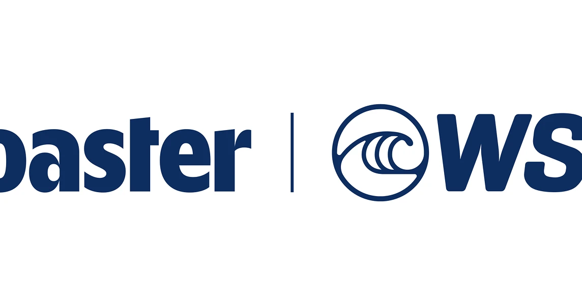
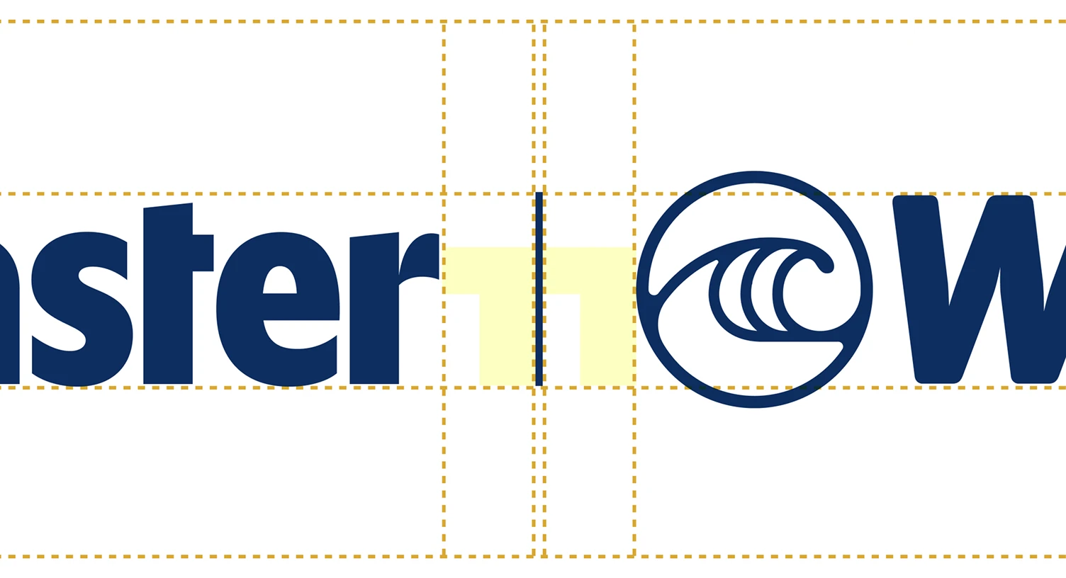
Separate the two logos with a clear gap and divider
//
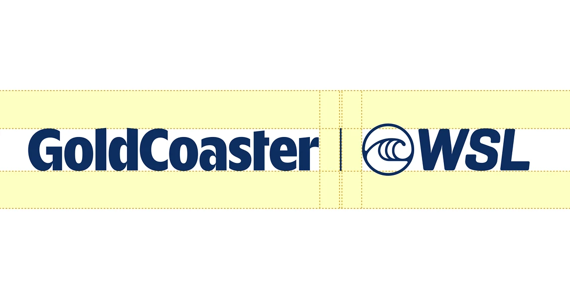
Align them consistently
/write something
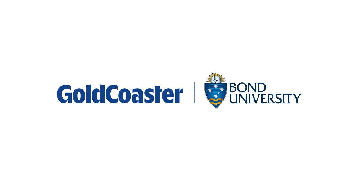
Size the partner logo so neither mark overwhelms the other
Lockup spacing
The gap between the GoldCoaster wordmark, divider and partner logo is built using the X unit from the G. This keeps all lockups consistent, regardless of partner size or format.
Incorrect usage
To keep the wordmark consistent and recognisable, do not alter its form, spacing or appearance.
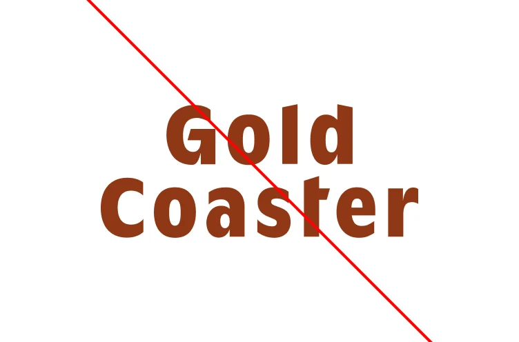
Don’t change the spacing or layout of the wordmark
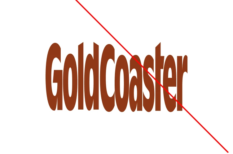
Don’t stretch or compress it
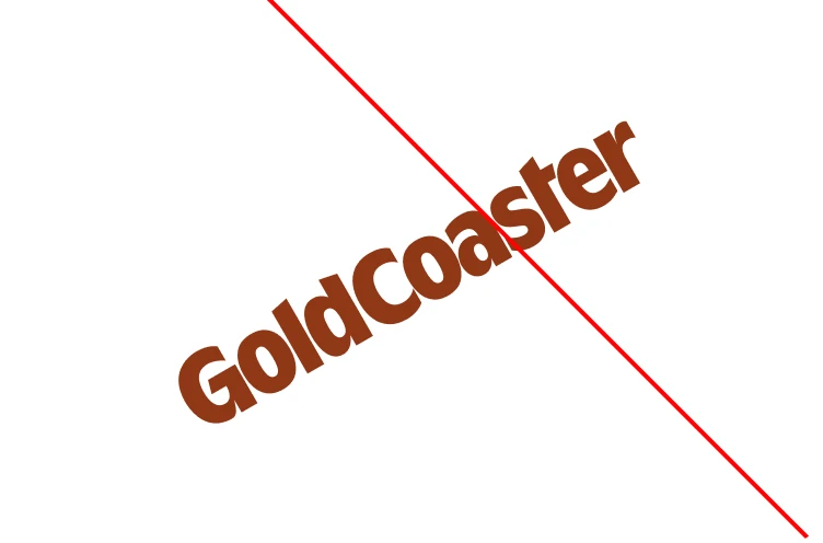
Don’t rotate it or place it on unusual angles
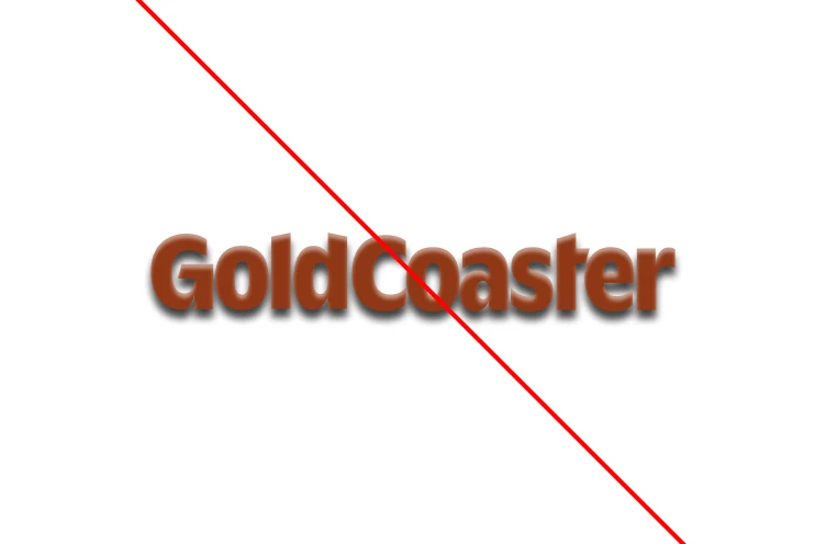
Don’t add effects such as shadows, glows or bevels
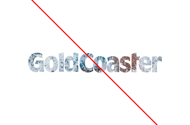
Don’t use the logo as an image mask
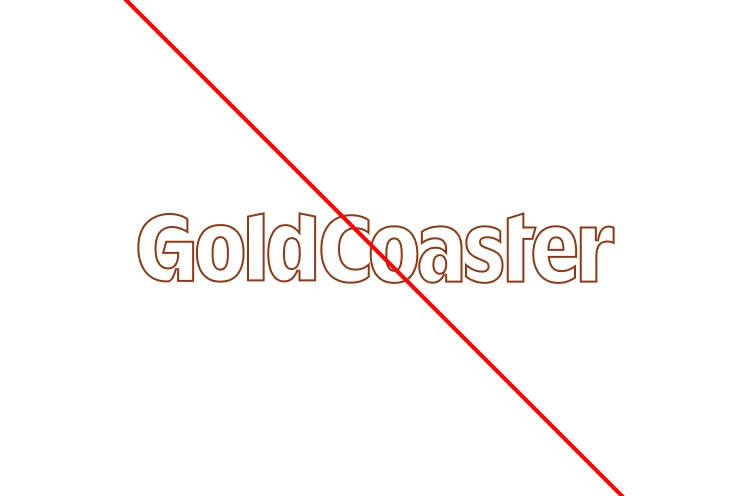
Don’t outline it or add strokes
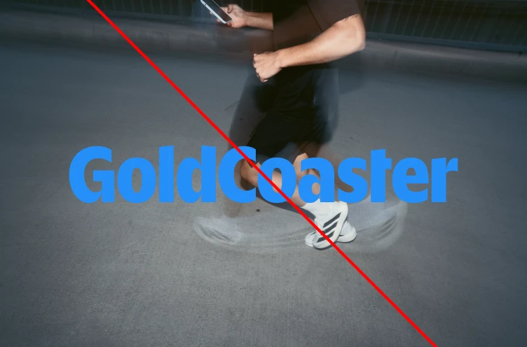
Don’t place it on backgrounds that reduce legibility
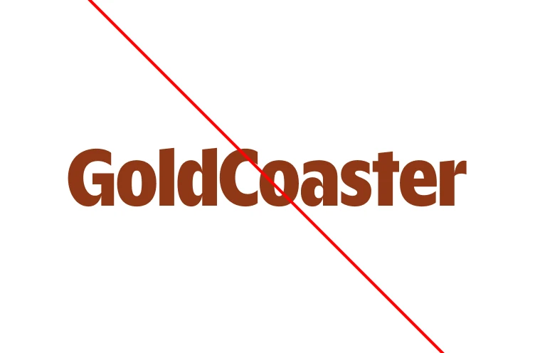
Don’t redraw, retype or reconstruct it. Note the ‘t’.
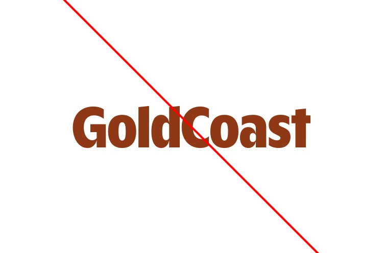
Don’t make other ‘logos’ with display typeface.
Logo in use
Campaigns and brand moments
//
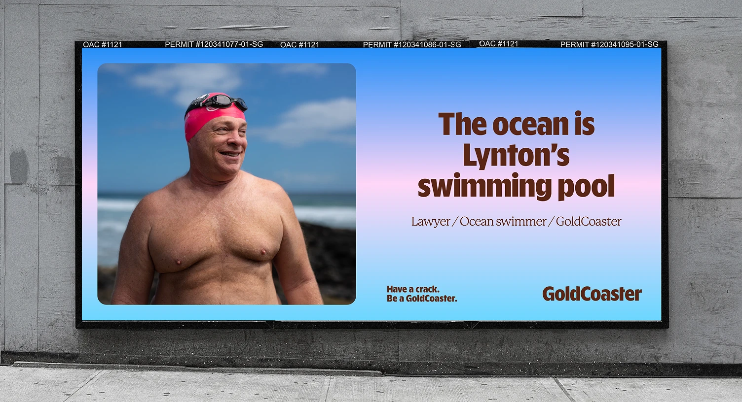
Situation 2
//
Situation 3
//